Here is my attempt at a pithy illustration of the bias-variance tradeoff. If you search, you will find there are many articles available. But you are not alone if you find the concept elusive. I think that’s partly due to contexts (plural). At the lower level, many of us are introduced to the desirable properties of an estimator such as the sample mean or the regression coefficients. In a linear regression, we learn the ordinary least squares (OLS) coefficients are BLUE; they are the best linear unbiased estimators. To be “best” is to have the minimum variance (aka, most efficient) among estimators who are unbiased. In that context, we’re sort of getting unbiased and low variance.
But in prediction models (i.e., machine learning) we face a trade-off. The two best metaphors here are:
The bullseye metaphor that is common and helpful. Low bias is accuracy: on average the estimates approximate the true parameter value. Their average is near the bullseye. On the other hand, low variance is precision (aka, low dispersion): the estimates cluster together, they are not greatly dispersed.
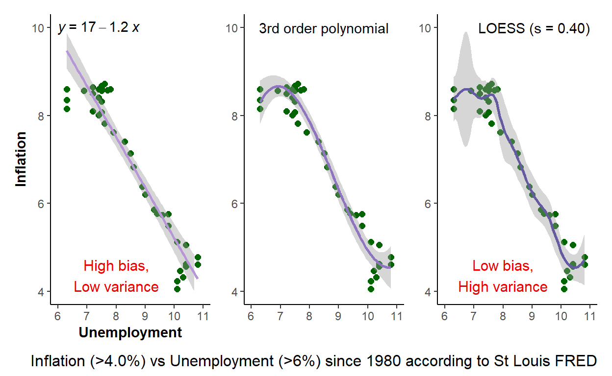
Underfitting versus overfitting: a simple model tends to underfit. The simplest model that I can think of is a univariate linear regression: this model has low variance but high bias. On the other hand, the local regression (aka, LOESS), by definition with the shortish span I gave it, fits this “training” dataset tightly. At each in-sample predicted inflation (as the dependent, to illustrate), our smooth line by design is a good estimator. It has low bias. On the other hand, especially in the high-inflation/low unemployment you can observe the high dispersion of this model. It has high variance. Put simply, this smooth LOESS line looks like a good fit (it is an accurate predictor) but, at the same time, it exhibits high variability (the dispersion of the CI betrays its high variance). I’ve discussed this with a view toward the plotted scatterplot that is in-sample. In practice, we’d really care about the model’s performance when using it to PREDICT out-of-sample.
Among the articles I’ve read on the bias-variance trade-off, two of the better are Bias Variance Tradeoff – Clearly Explained and Understanding the Bias-Variance Tradeoff by Scott Fortmann-Roe.
library(tidyverse)
library(fredr)
library(patchwork)
library(ggthemes)
library(ggpubr)
library(colorspace)

fredr_set_key(my_fred_key)

startdate <- as.Date("1980-01-01")
enddate <- as.Date("2021-07-01")

inflation_rate <- fredr(
    series_id = "PCETRIM12M159SFRBDAL",
    observation_start = startdate,
    observation_end = enddate
) %>% as_tibble()

unrate <- fredr(
    series_id = "UNRATE",
    observation_start = startdate,
    observation_end = enddate
) %>% as_tibble()

df1 <- unrate %>% left_join(inflation_rate, by = "date") %>%
    select(date, value.x, value.y) %>% rename(unemp = value.x, inflation = value.y)

# this is an arbitrary filter for the purpose of an "interesting" scatter
df2 <- df1 %>% filter(inflation > 4 & unemp > 6)

# rather than call the same ggplot three times, let's make it a function
phillips_scatter <- function(data = df2) {
    ggplot(data, aes(x = unemp, y = inflation)) +
        geom_point(size = 2, color = "darkgreen") +
        scale_x_continuous(limits = c(6, 11)) +
        scale_y_continuous(limits = c(4,10)) +
        theme_classic() +
        ylab("Inflation") +
        xlab("Unemployment")
        # theme(axis.title = element_blank())
}

# Don't need this but I love color and want practice with the killer colorspace package
colors_vec <- sequential_hcl(5, palette = "Purp")
color_1 <- colors_vec[1]
color_2 <- colors_vec[2]
color_3 <- colors_vec[3]
color_annote <- "red2"

p1 <- phillips_scatter() + geom_smooth(method = "lm", level = 0.99, color = color_3) +
    stat_regline_equation(label.y = 10, aes(label = ..eq.label..)) +
    theme(axis.title = element_text(face = "bold")) +
    annotate("text", x = 8, y = 4, vjust = "bottom", label = "High bias,\nLow variance",
             color = color_annote, size = 4)

p2 <- phillips_scatter() +
    geom_smooth (method = "lm",
                formula = y ~ poly(x, 3, raw = TRUE),
                level = 0.99, color = color_2) +
    theme(axis.title.y = element_blank(),
          axis.title.x = element_blank()) +
    annotate("text", x = 8.5, y = 10, label = "3rd order polynomial")

p3 <- phillips_scatter() + geom_smooth(span = 0.40, level = 0.99, color = color_1) +
        theme(axis.title.y = element_blank(),
              axis.title.x = element_blank()) +
    annotate("text", x = 11, y = 10, hjust = "right", label = "LOESS (s = 0.40)") +
    annotate("text", x = 8, y = 4, vjust = "bottom", label = "Low bias,\nHigh variance",
             color = color_annote, size = 4)

p1 + p2 + p3 +
    plot_annotation(
        caption = "Inflation (>4.0%) vs Unemployment (>6%) since 1980 according to St Louis FRED",
        theme = theme(plot.caption = element_text(size = 12)))