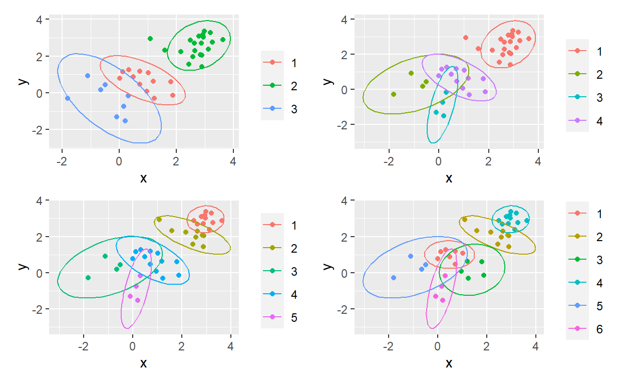
Since I’m (re-) learning k-means clustering in Matt Dancho’s brilliant course, I thought I’d apply map() in pursuit of a “ggplot factory.” Please note that my ellipses are not proper renders of the k-means cluster; e.g., their center is not the k-means centroid. I lazily here used ggplot’s built-in stat_ellipse() as a bit of visual flair. I’m getting more comfortable with the power of purrr. Yay!
library(tidyverse)
library(patchwork)

# bivariate normal
set.seed(55)
rows <- 40
simulation <- tibble(x = c(rnorm(rows/4),
                           rnorm(rows/4, mean = 1.0, sd = 0.8),
                           rnorm(rows/4, mean = 2.0, sd = 0.6),
                           rnorm(rows/4, mean = 3.0, sd = 0.4)),
                     y = c(rnorm(rows/4),
                           rnorm(rows/4, mean = 1.0, sd = 0.8),
                           rnorm(rows/4, mean = 2.0, sd = 0.6),
                           rnorm(rows/4, mean = 3.0, sd = 0.4)))

# accepts data = matrix and number of k-means centers
# and returns a vector of clusters.
# Notice as_factor() returns a factored vector so ggplot's color will work
kmeans_vec <- function(data, centers= 3){
    w <- data %>% kmeans(centers = centers, nstart = 100)
    w$cluster %>% as_factor()
}

range <- 3:6 # for example, we want n = {3, 4, 5, 6} clusters
clusters_df <- range %>% map_dfc(~kmeans_vec(simulation, .)) %>% setNames(range)
# map_dfc returns a column-bound dataframe
# each column is a vector that contains the cluster assignment
# e.g., column named '3' has {1, 2, or 3}.
clusters_df
# A tibble: 40 × 4
`3` `4` `5` `6`
<fct> <fct> <fct> <fct>
1 1 4 4 1
2 3 2 3 5
3 3 3 5 6
4 3 2 3 5
5 1 4 4 1
6 1 4 4 3
7 3 2 3 5
8 3 3 5 6
9 3 3 5 6
10 3 3 5 6
# … with 30 more rowssim_bind_centers <- cbind(simulation, clusters_df) #bind the simulation matrix to the clusters df
# this function returns a ggplot. Notice:
# I had to use get()
# stat_ellipse() works out of the box!
gg_obj <- function(data, vector = 4) {
data %>% ggplot(aes(x = x, y = y, color = get(as.character(vector)))) +
geom_point() +
stat_ellipse() +
theme(legend.title = element_blank())
}
# p_output is a list of 4
p_output <- range %>% map(~gg_obj(sim_bind_centers, .))
p1 <- p_output[[1]]
p2 <- p_output[[2]]
p3 <- p_output[[3]]
p4 <- p_output[[4]]
(p1 + p2) / (p3 + p4)